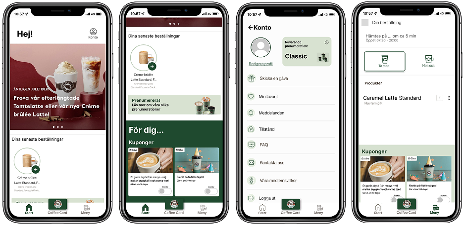

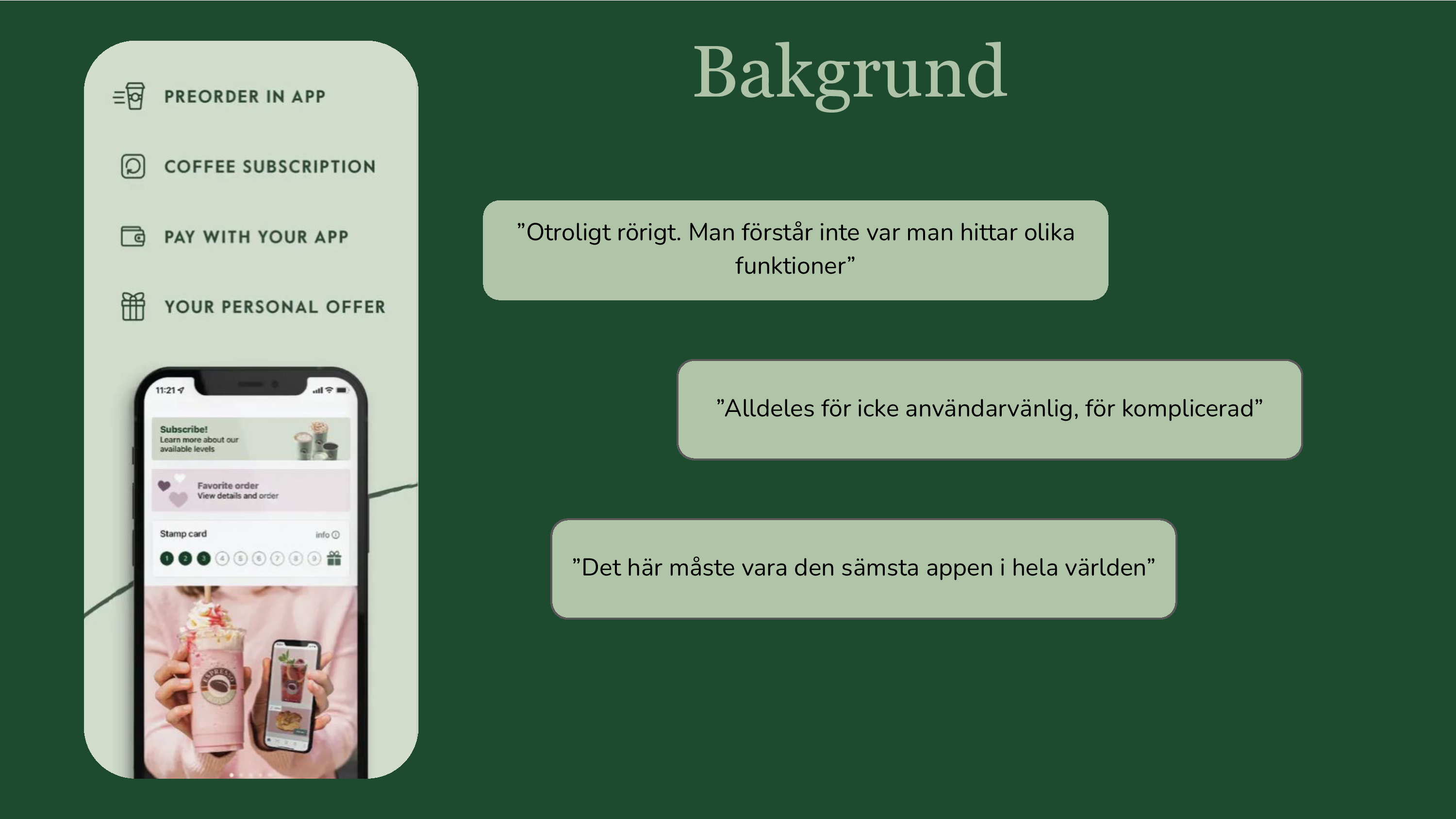
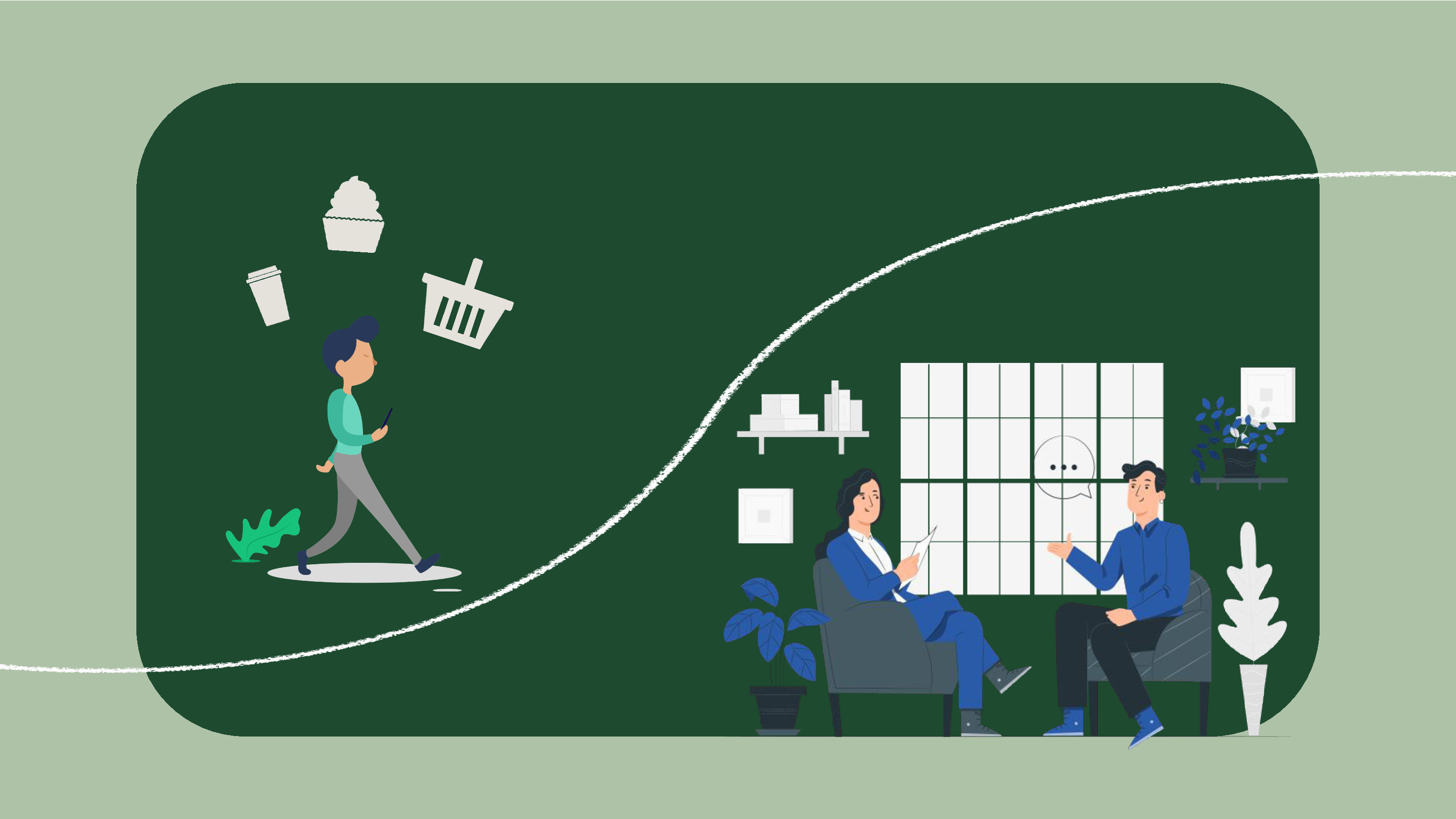
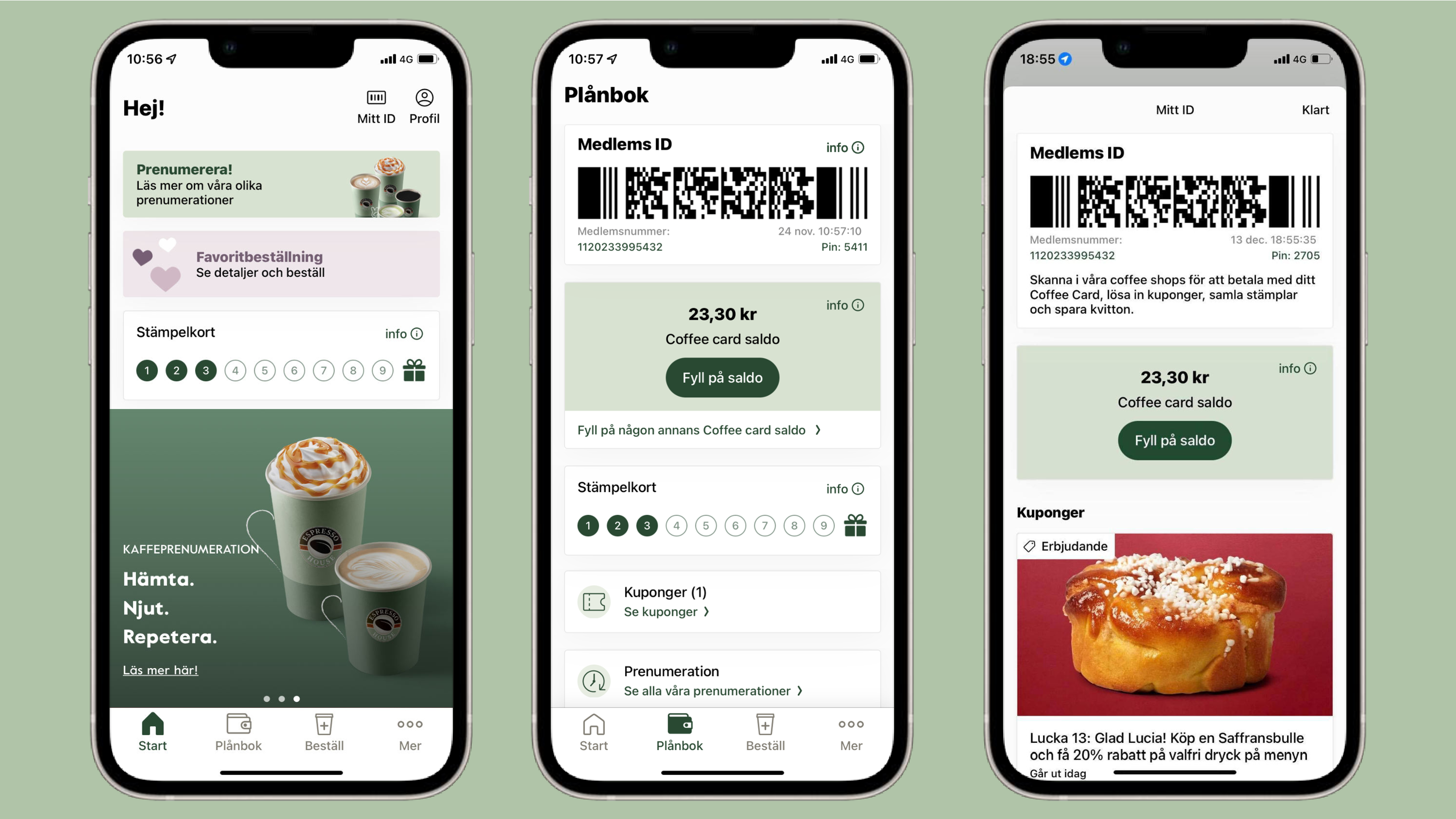
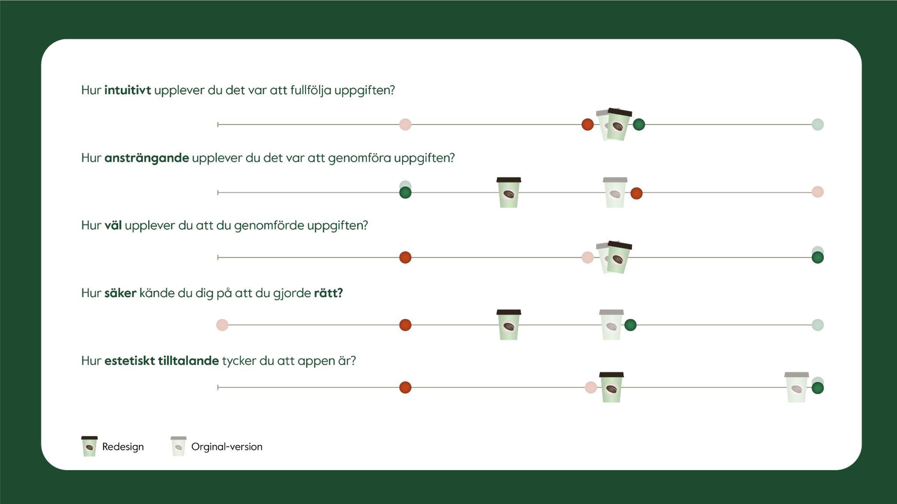
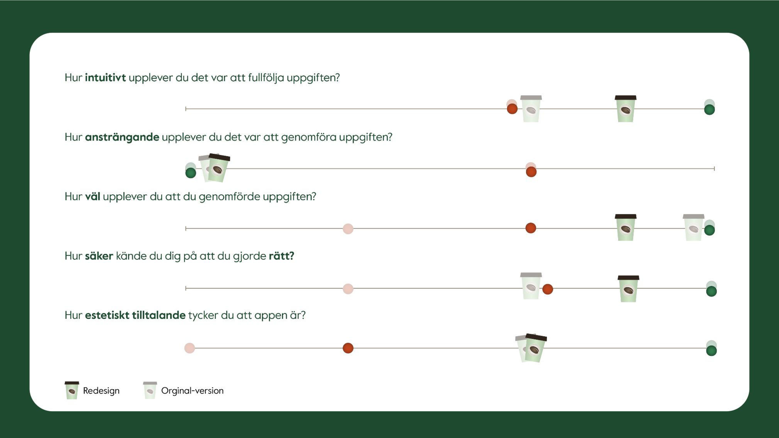
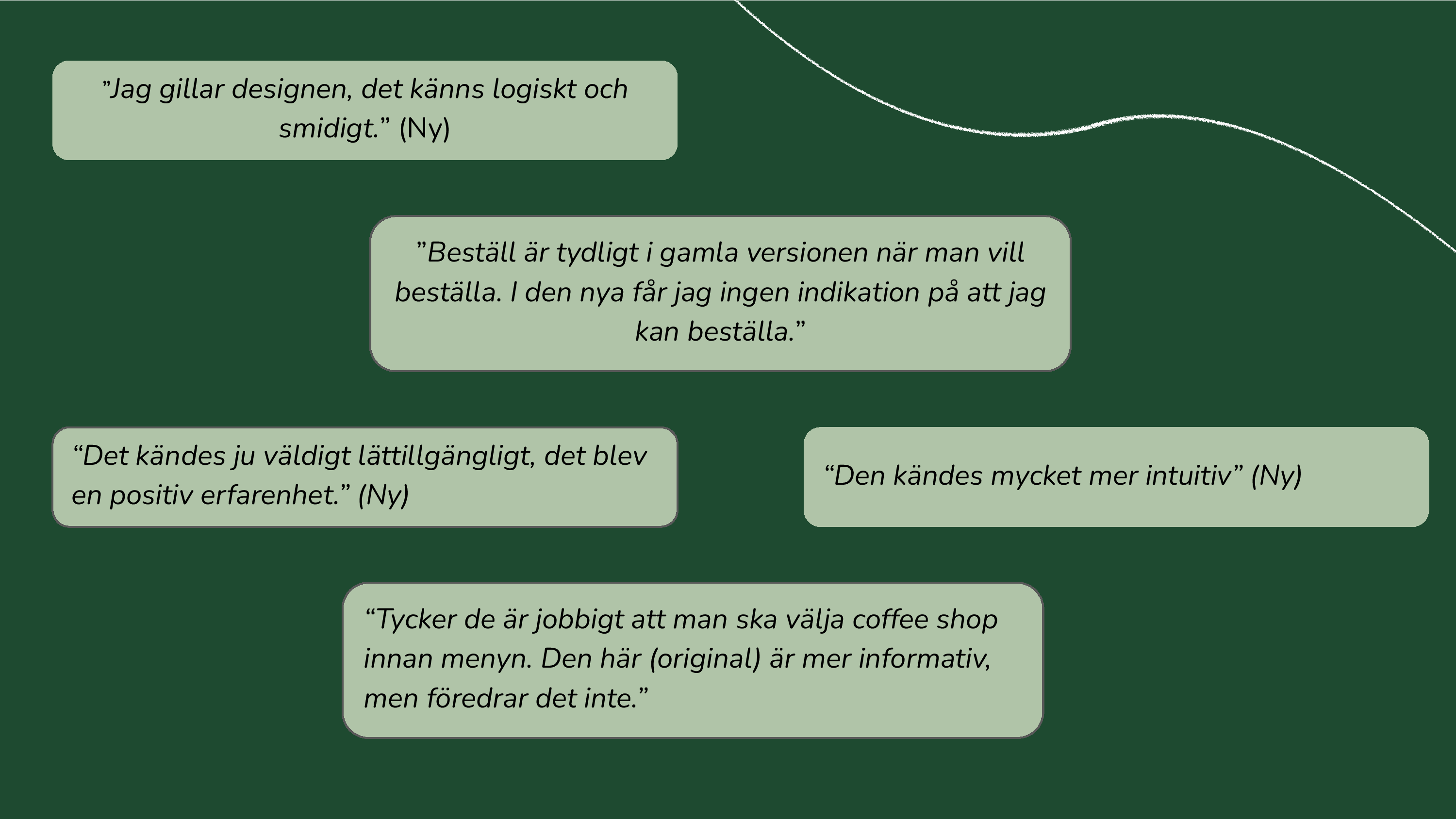
Espresso House's app design was perceived by regular users to be elegant and aesthetically pleasing, but after theoretical evaluation and a first round of user testing, it was noted that some issues regarding usability within the app could be improved. Some factors from Nielsens usability heuristics that could be improved were consistency, consideration of user resources and visual clarity.
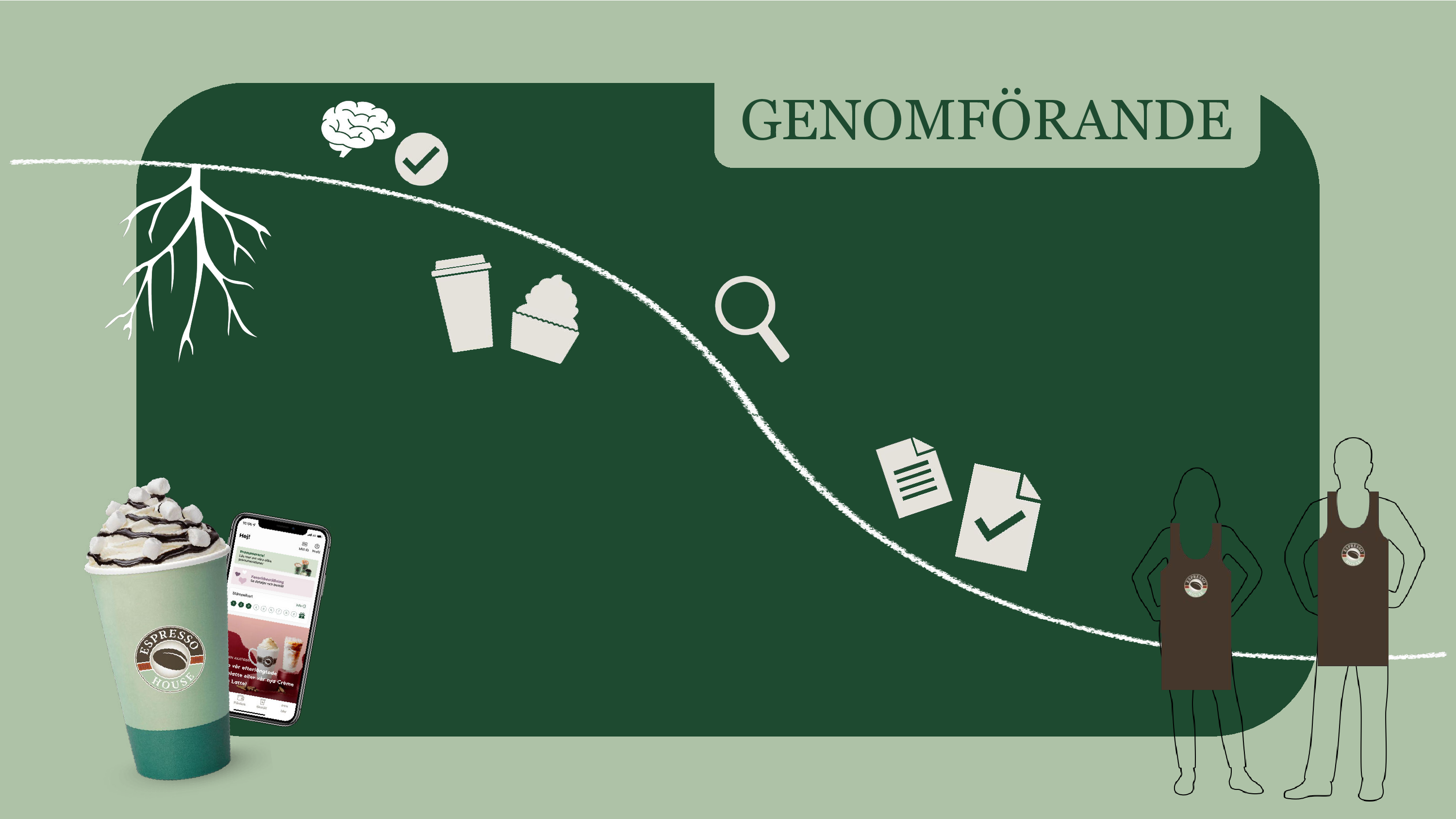
The last two videos present two smaller walk throughs of ordering; one is investigating payment options and the other one is customizing an order in the reworked app. The rework is a synthesis of a wide variety of user testing including both new users, expert users as well as both within- and in-between subjects tests. Additionally, tests were done in different order to see if it made any difference to start with the old or new version when comparing the two.
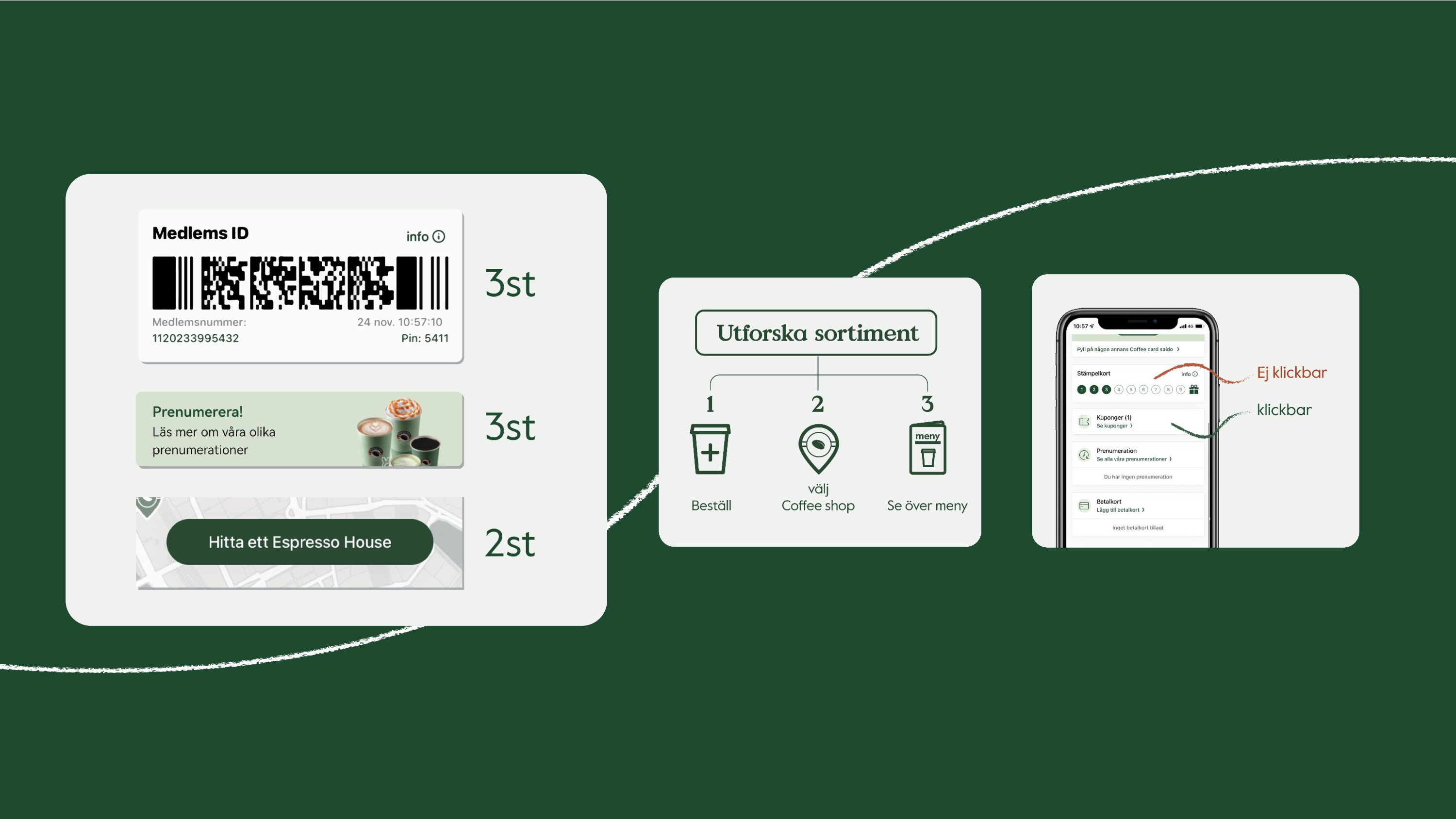
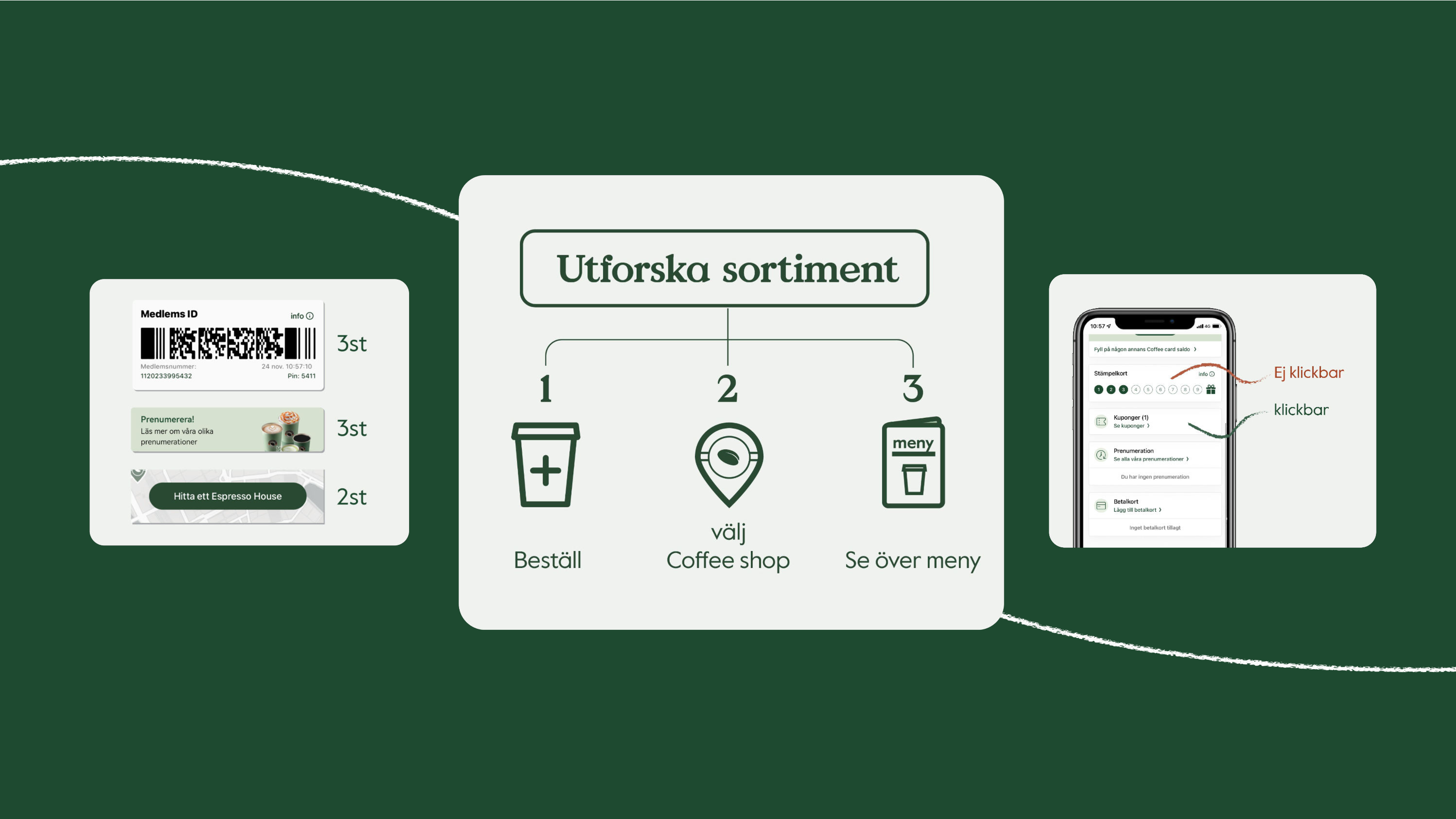
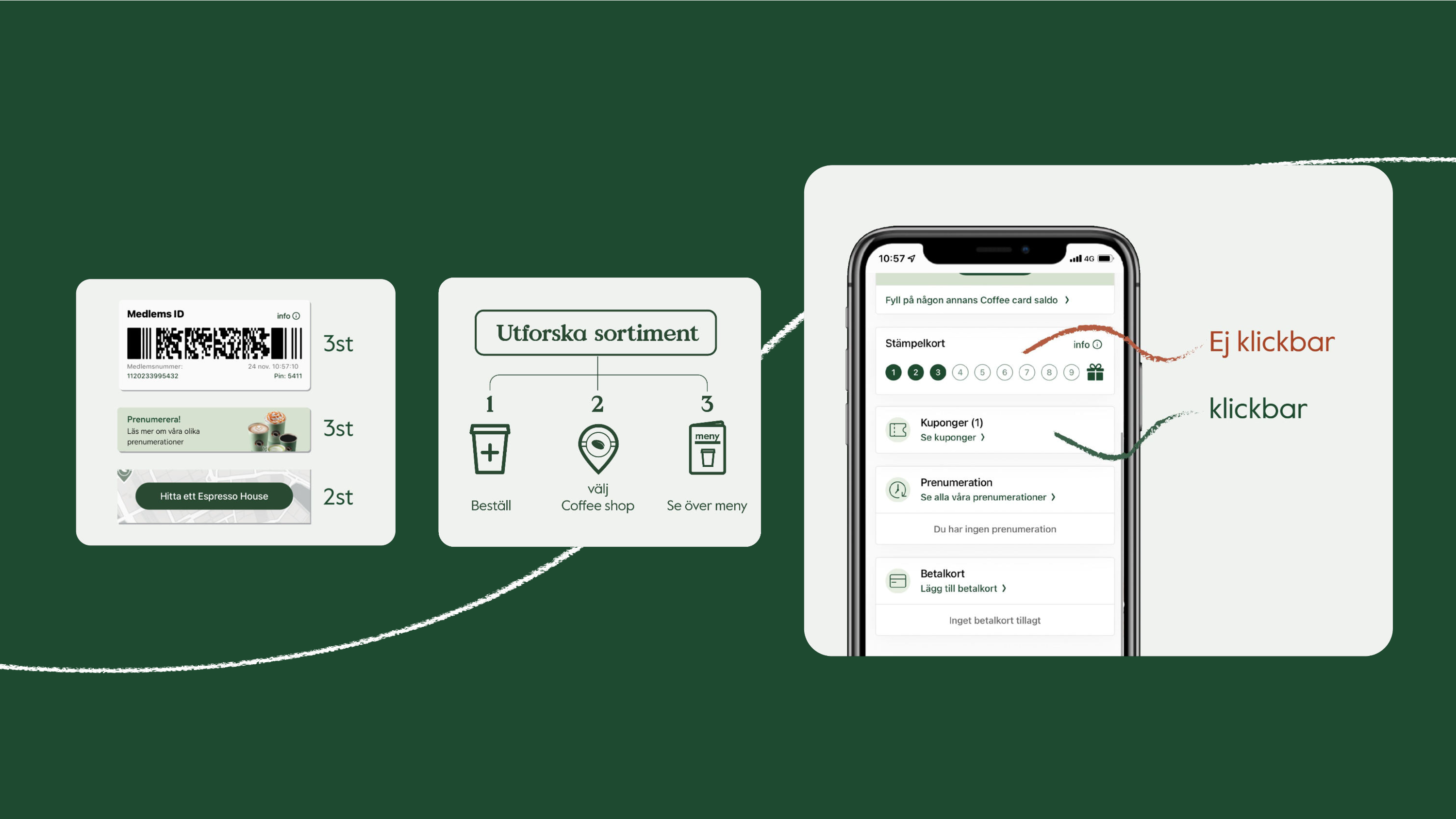
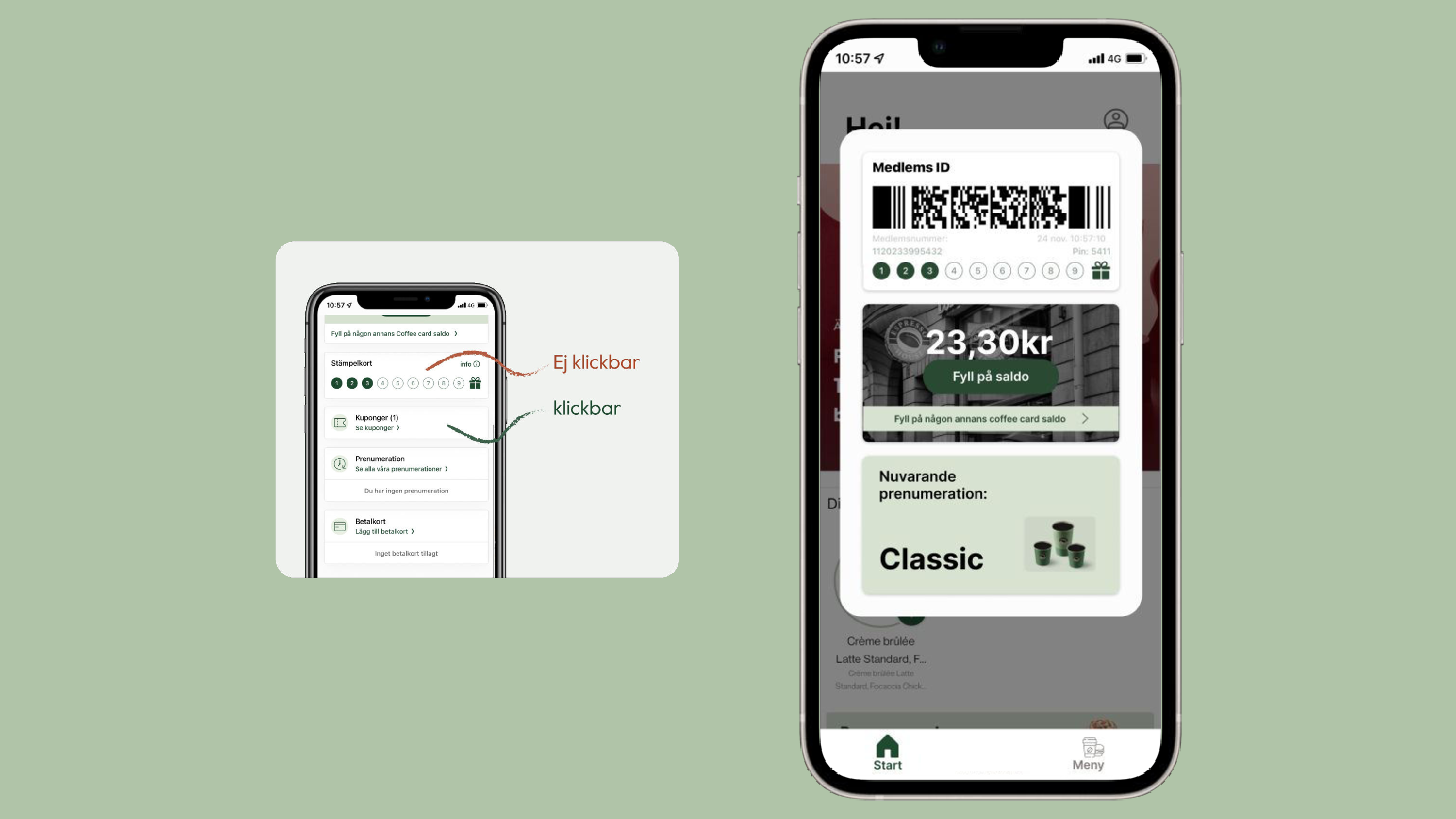
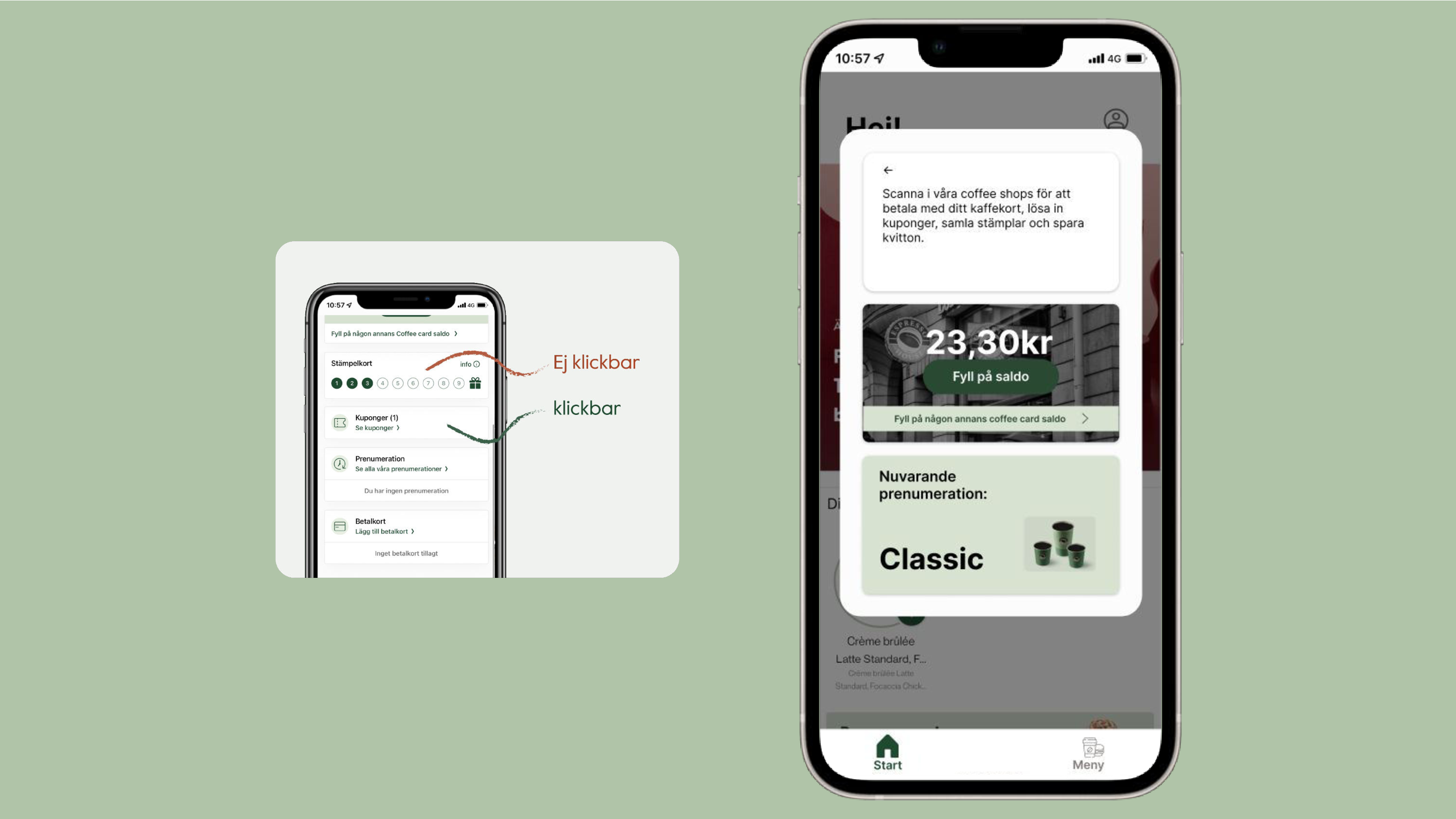
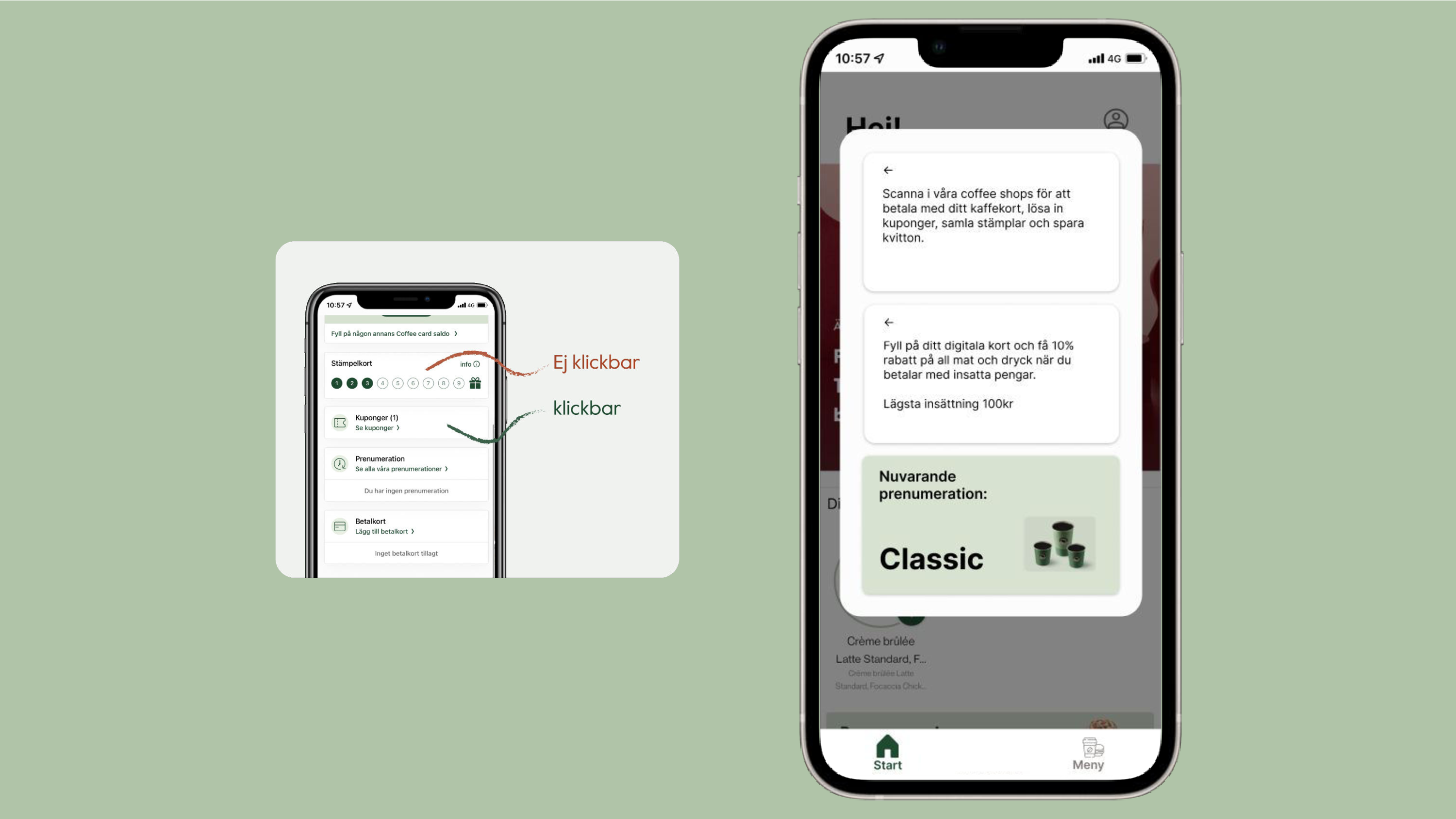
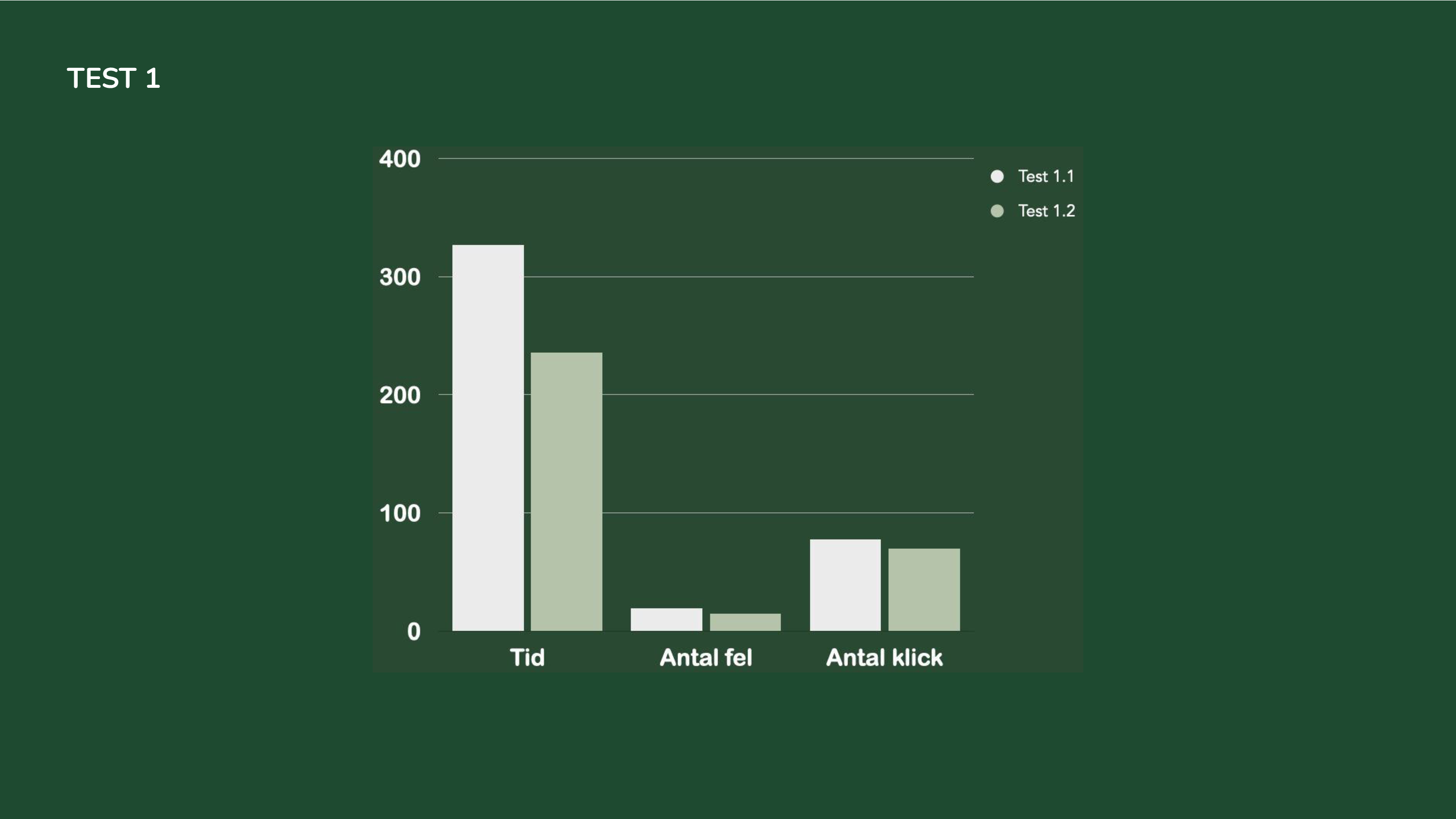
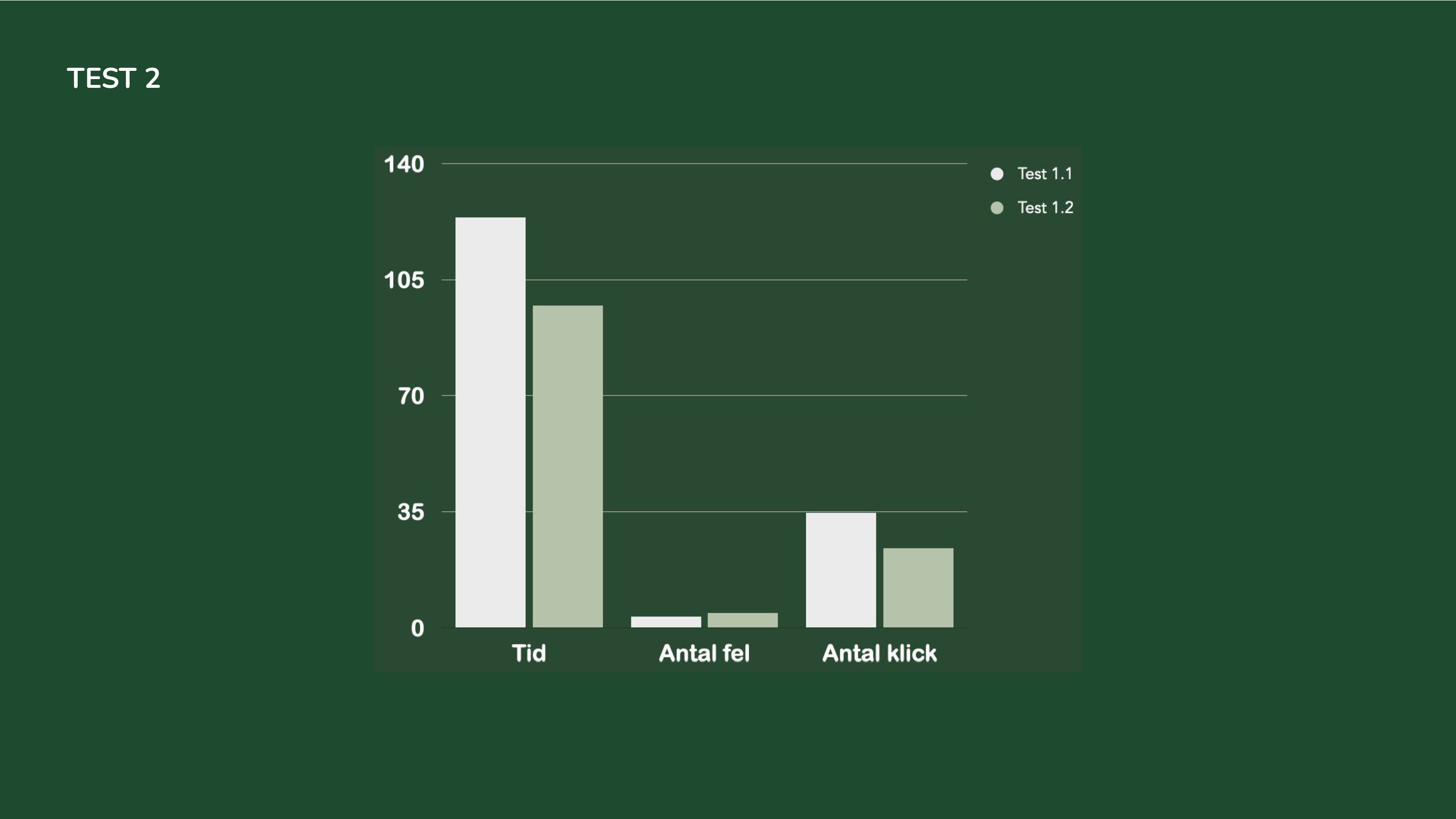
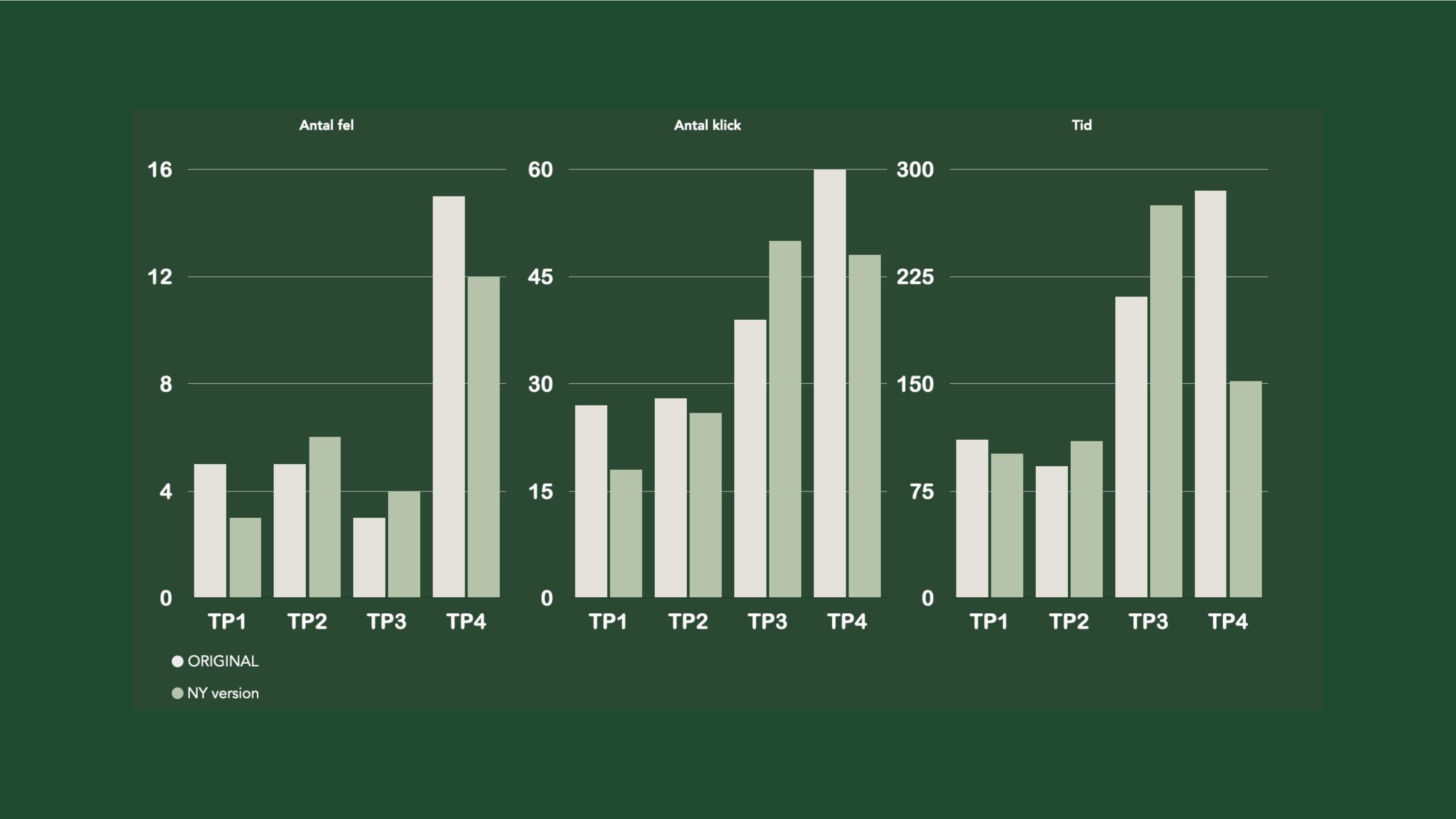
The measured results, such as amount of clicks and time for each task, showed improvement in reaching the task goal and navigation time. Prototype made in Figma.
Group members: Malkolm Ahlberg, Ellinor Axelsson, Edith Pålsson, Aron Uggla